TASK
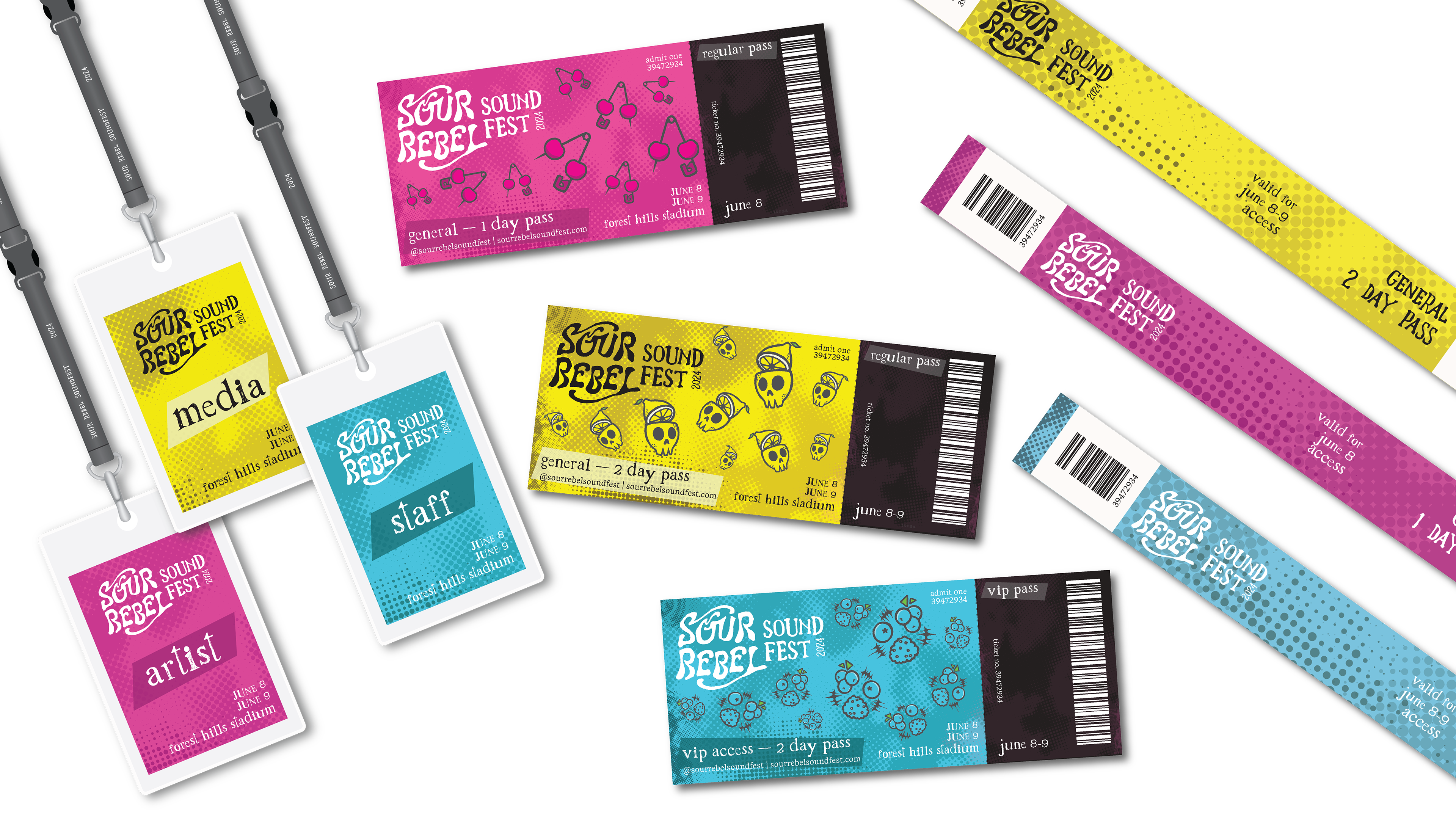
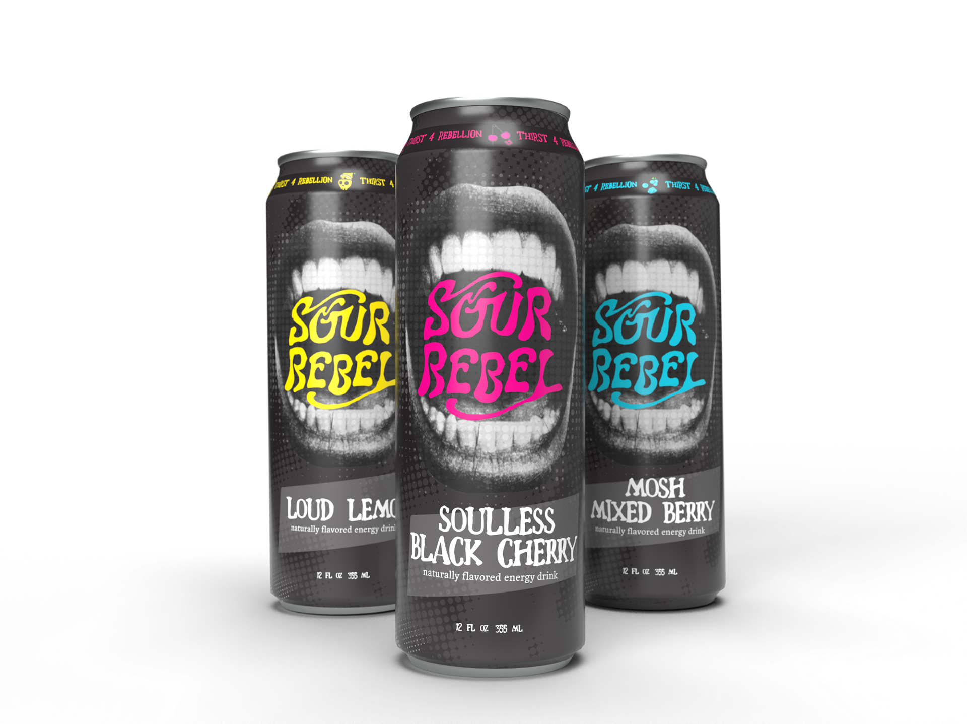
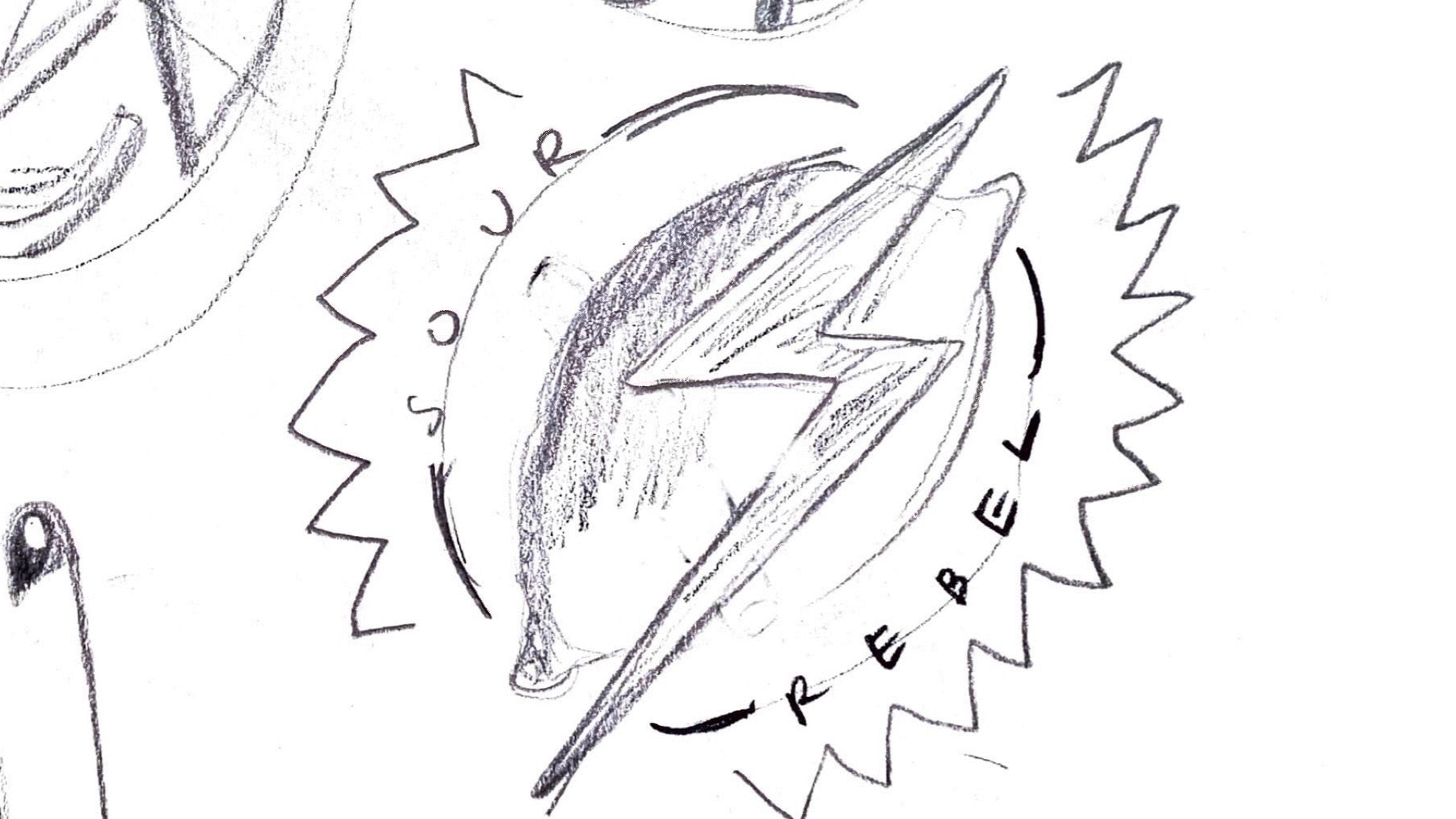
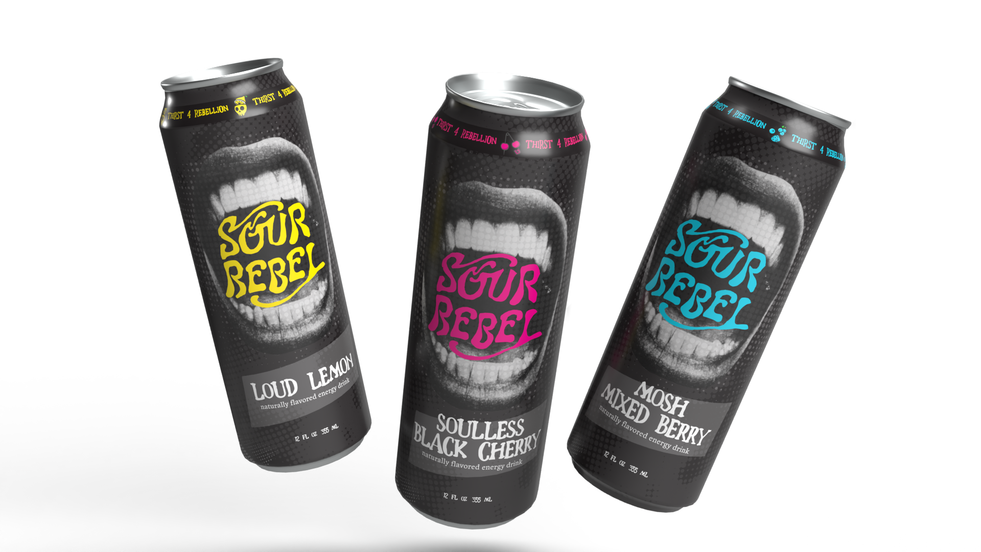
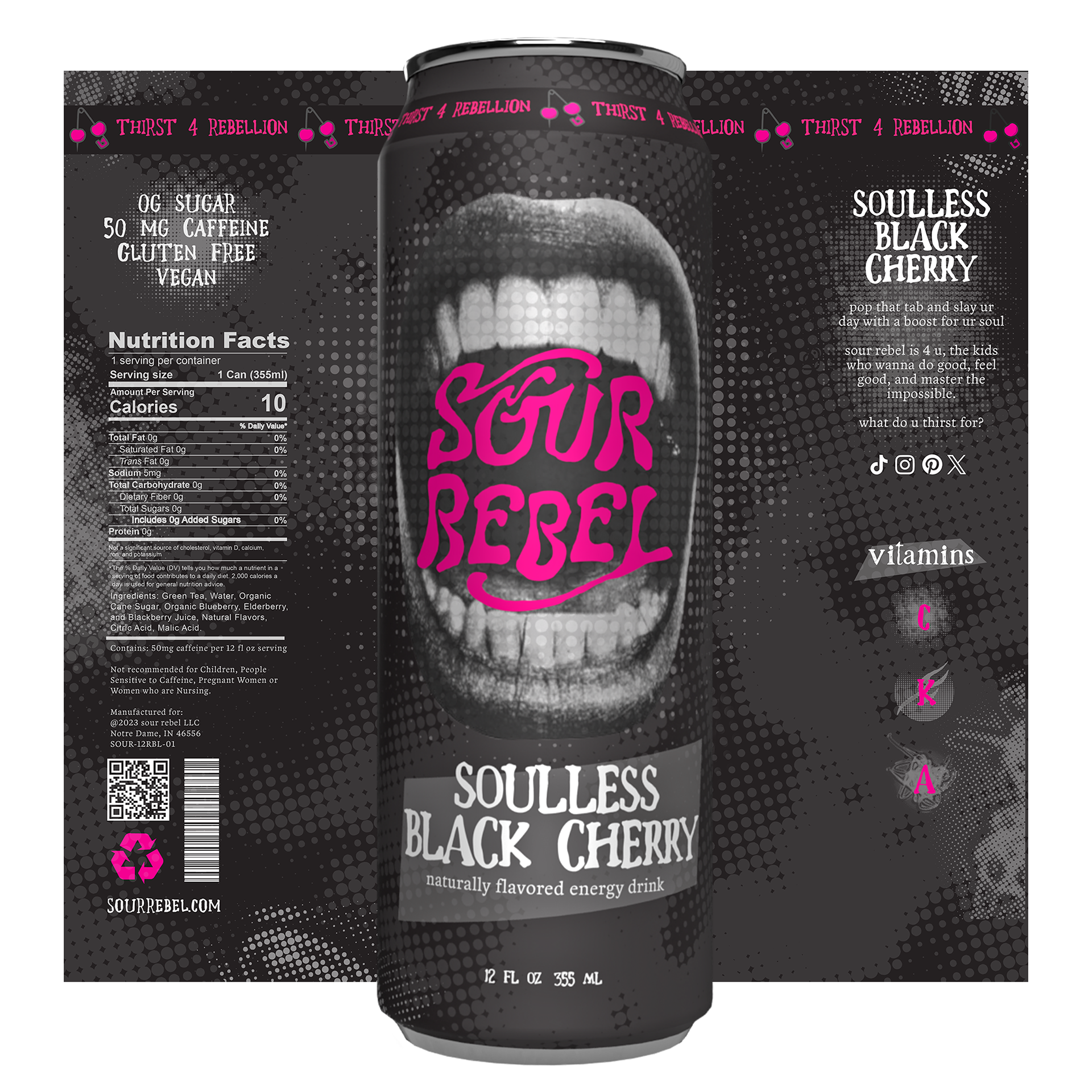
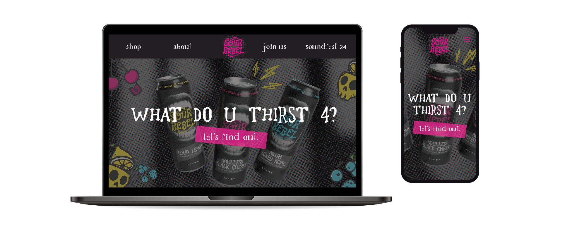
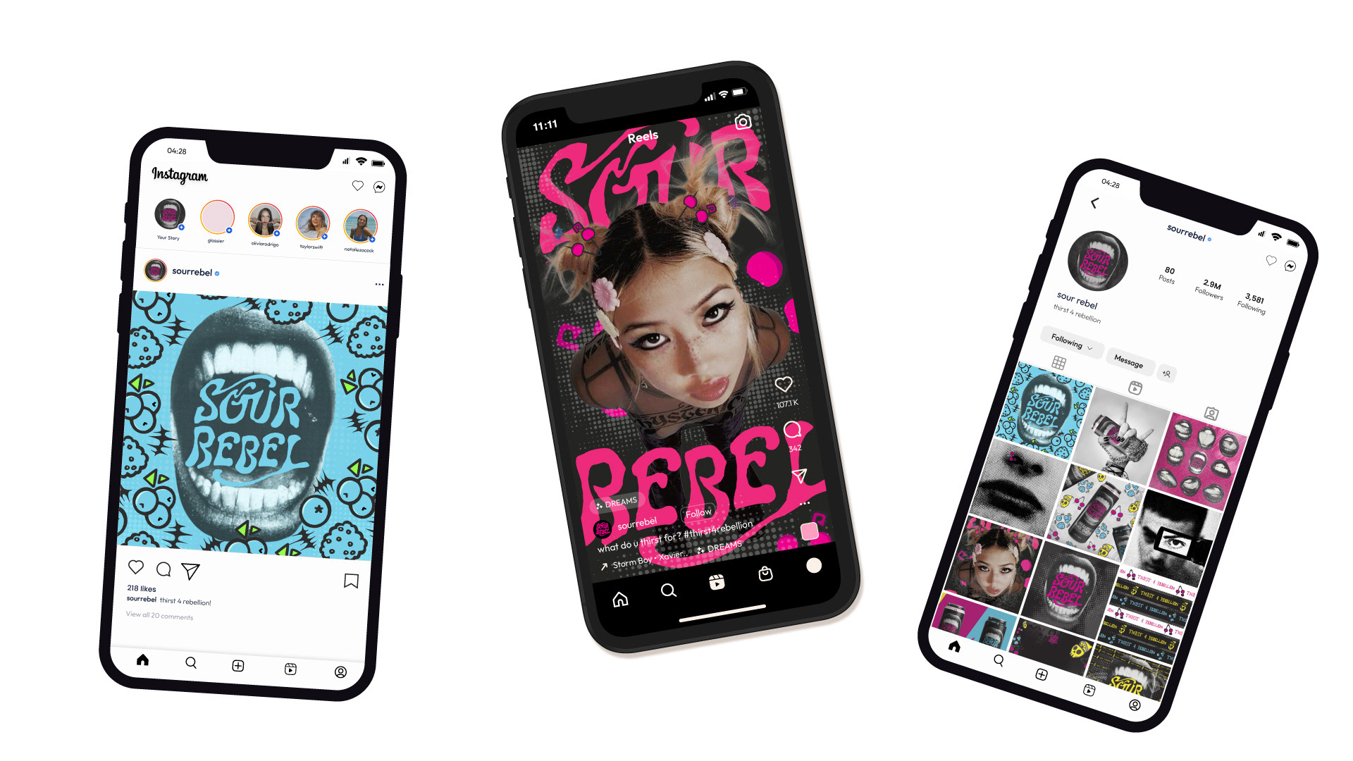
For this project, I collaborated with another designer, Emma Kirner, in the creation of an energy drink brand. Together, we worked on the brand positioning, visual identity, and packaging design. We decided to create our mockups from scratch to better represent the brand personality.

THE PROBLEM
Energy drinks are characterized by large amounts of stimulant compounds, usually caffeine. They have risen in popularity due to their convenience and high caffeine count, developing into a multi-billion dollar industry. There have, however, been detrimental health risks linked to the consumption of such high amounts of caffeine. About 65% of consumers have expressed concerns about product safety of energy drinks.
BRAND POSITIONING
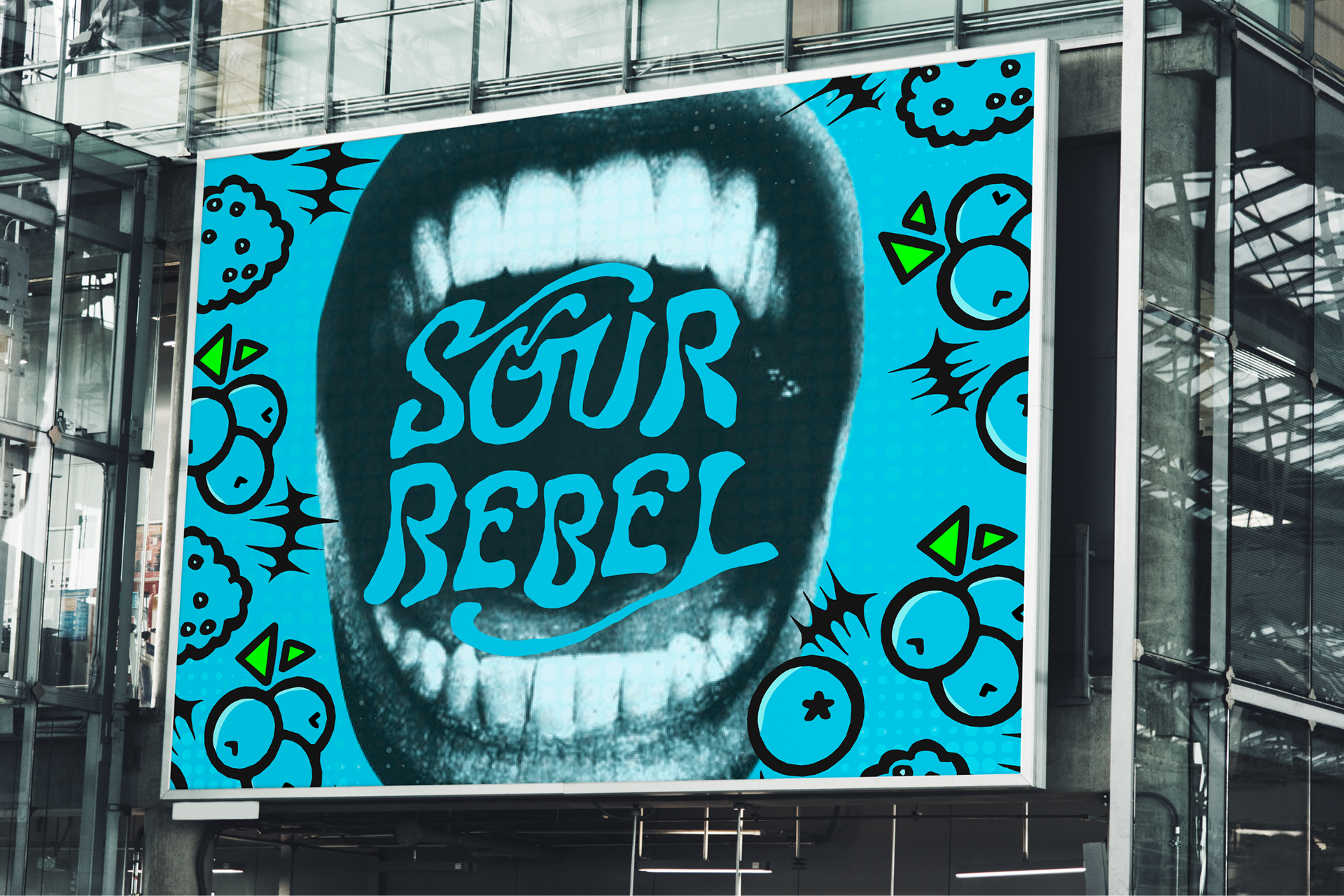
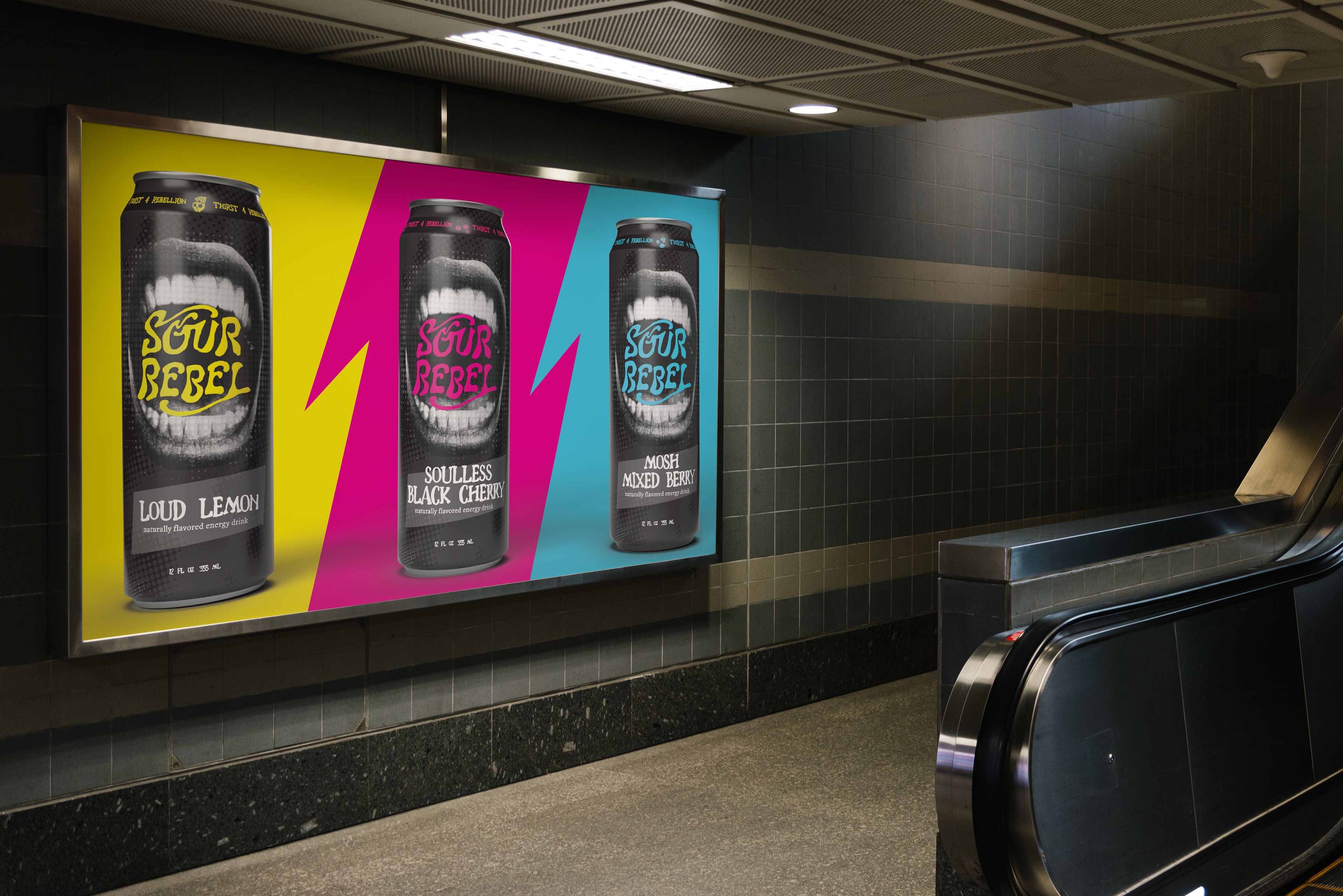
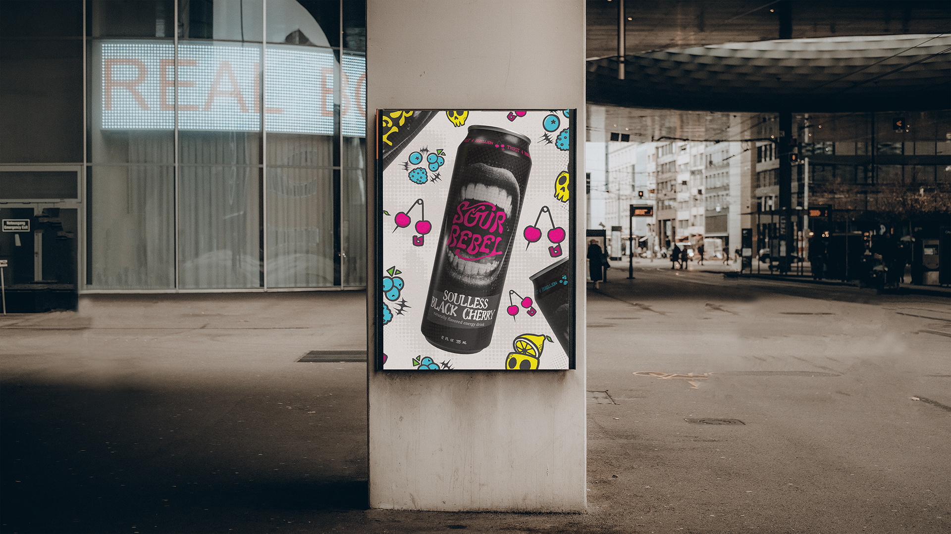
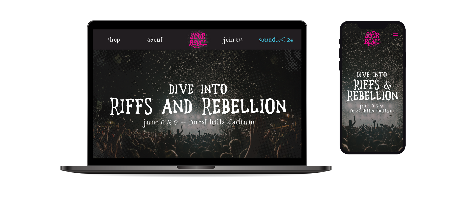
With our primary customer base being Gen Z, we decided to position our brand with a punk aesthetic, standing as “a rebellion against the traditional energy drink.” Sour Rebel leans into a feminine and playful personality to differentiate from the traditional male-oriented, “jock identity” energy drink brand. With punk culture in mind, we utilized the historical contexts of the movement in our visual identity, branding ourselves as down-to-earth, authentic, and consumer-oriented. We also employed symbols and visual assets that refer to music and sound, which connects with the original culmination of the punk movement.